Our eight booths
Pop ’67 — the Flashroom booth
Four colours · Your own pop art. The story, format and a few ways to make it your own.
Pop ’67 brings a four-colour pop-art direction to the app’s grid layout. The emphasis is on a composition you can read across as well as down.
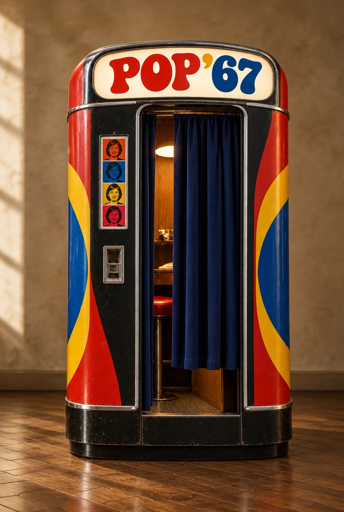
An original Flashroom design. Era and city names are creative references, not claims about a historic machine.
A reference, rather than a reproduction
Warhol’s use of photobooth portraits is documented by museums; Flashroom does not reproduce his copyrighted paintings or claim that Pop ’67 uses his process. The booth name is a creative label. Our art articles explain the historical objects separately from the app’s colour treatment.
Let repetition do some work
Keep the framing similar through the session, then change just the gaze or expression. Repetition makes those differences easy to see. A clear silhouette and less cluttered background can help a bold treatment remain readable. You do not have to make a large gesture in every frame to create a composition.
Choose a grid for comparison
The two-by-two arrangement places four frames in a compact field. Compare it with a vertical strip when deciding whether you want the picture to read as a sequence or as a set. The sample artwork introduces the colour direction; your export depends on your own session. Save the complete result before using an individual frame elsewhere.
The portrait mood